The ideas, symbolism, and creation of The Born Wanderess logo is a truly beautiful story and was brought to life by three amazing artists.
It all began with my amazing traditional hand-poked tattoo artist in Bali. We met in a cafe so we could chat and get to know each other. Jerry came up with a beautiful design after our chat, having listened to me talk about my trip and picking up on key things I had said without me even realising.
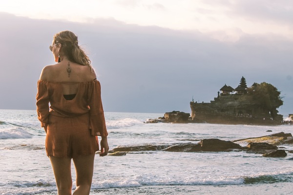
I left it entirely up to his choosing what he wanted to create and where he wanted to tattoo it on my body.
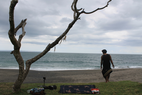
The day it came to do the tattoo, Jerry picked me up from my villa in Seminyak and we drove on his scooter to Munggu Beach, a beautifully secluded black sand beach.
We sat and meditated for 20 minutes, Jerry did a small incense ritual and then the hand-poke tattooing began.
It was such an amazing experience. No pain, no blood, peaceful surroundings listening to the waves crashing. Bliss!
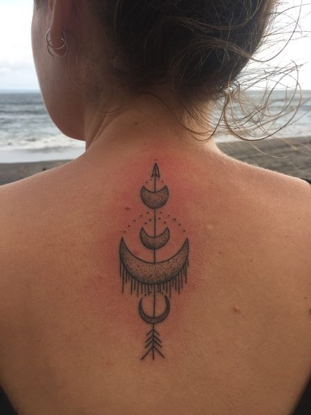
So, how did Jerry come up with this specific design for me?
An arrow represents new direction, a new chapter in life, looking forward and not back. The direction of the arrow is also symbolic in that pointing upward represents to direction of ones growth.
The crescent moon symbolises femininity, expulsion of negative energy from ones personal, professional and spiritual life.
An arrow shown through a crescent moon symbolises the creation of a “guided missile”, one that can travel long distances and still hit its mark.
You can see that the tattoo deeply represents me and especially my journey of self and world discovery.
When thinking about my logo I knew I wanted it to represent not only my brand but to represent me and my journey. It couldn’t be just some random creation. Each element had to be rich with symbolism, much like my tattoo.
Why come up with something else when I already had such an important representation of me on my body.
With the help of my artist brother, Nick, he was able to incorporate a travellers compass/rose into the existing tattoo design. The compass he drew nestled beautifully within the main crescent moon.
A travellers compass/rose was the perfect addition as it is a symbol for guidance, its points travellers in the right direction.
Finally with the help of Graphic Designer, Sara, of Inkling Studios she was able to put all the ideas into one over-arching design along with variations and incorporating fonts and a colour palette that truly represents me and The Born Wanderess brand.
What do you think?